To convert more blog visitors into paying customers, you need to learn how to ‘push’ the prospect towards the next step in their purchase journey.
If you try to get blog visitors to do too much before they are ready (like buy), your efforts will fail.
More people are willing to take small steps. That’s why it is more effective to focus only on the ‘next’ step. Taking a single small step is easier, less risky.
For example, if you operate an eCommerce site, you need to get the blog visitor to leave the blog and visit a product page or even a category page so they can then take further actions towards the purchase (“add to cart!”)
That ‘push’ from the blog post to another page is going to be in the form of a call to action (CTA), which we refer to here as an MVE link. You’ll see why below.
Unless the user visits a page which has been created to capture leads or make sales, the user will typically be blocked from taking the
As the Marketing Manager, it is your job to push them to the next step in the funnel
Escalation is the art of moving the prospect one step closer towards the purchase. Escalation must be intentional and well-thought through. Do not leave users to find their own way. It is your responsibility to guide them, push them, and ultimately, convert them.
Pick One Escalation Goal and Focus on it
The goal of every touch-point with your prospects is to escalate the relationship. What do you want them to do next? Book an appointment? Request pricing? Visit a specific sales page? Consume specific pre-sell content? Make a purchase?
You must decide what you want your prospect to do, then focus on this one CTA in your blog post (and everywhere else on your site).
Do not confuse the user with many, equally-attractive links. This will only be distracting to them, and possibly even confusing.
You must pick one CTA, then highlight that CTA. By making it the most dominant link on your blog post, you should see an improvement in the number of prospects who visit pages which are more commercially important to the purchase journey.
Best link type = “MVE Links”
Our students conducted a study to see if the use of multiple links on a webpage would result in more people clicking those links. We hoped to prove whether or not additional links (other than the regular menu) would be helpful in creating additional conversions.
In this experiment, we presented real prospects with two different page variations in an AB test.
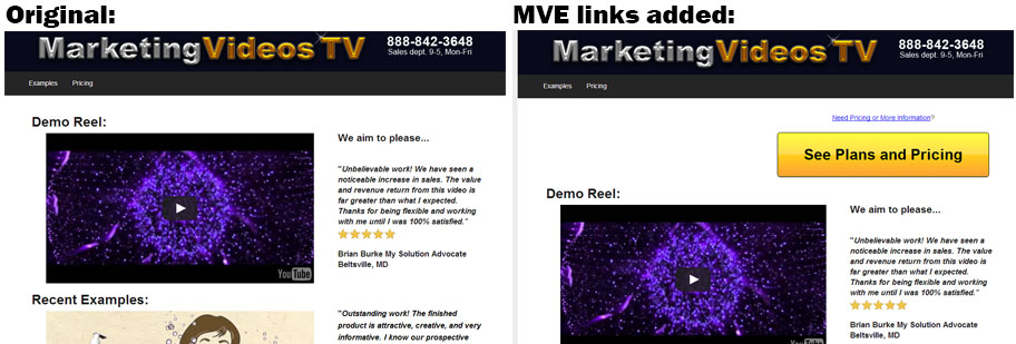
One page was normal (see the left side in the example below). On the other version of that page, we created multiple, visible, enticing (MVE) links, all pointing to the same CTA, which was a link to the pricing page.

On the MVE variation (right side in the above image), you can see two additional links at the top right, both prompting the user to visit the pricing page. (Further down that
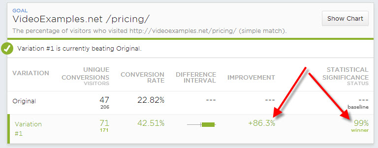
In the AB

Conversion Lessons to Take Away
Make your CTA links visible and enticing. The MVE links don’t need to be clown-orange, like the button below, but it must stand out from the other colors on the

Regardless of whether you use a beautiful banner or a loud button, like the above example, be sure to place it at the top of the page, as well as middle and bottom.
Placing a high-intensity link at the top of the page is essential because at least some of the blog visitors will arrive with high levels of purchase-intent.
If you force your prospects to wade through the entire blog article, slowly scrolling down the page, you have a better chance of them abandoning the site than if they have the chance to click thru the moment they arrive. Place at least one MVE link at the top of the page! Then another in the middle and yet another at the bottom.
By placing your MVE links in multiple spots on the page, you improve your conversion rates. If the reader doesn’t have time to consume the entire article (or gets bored) they will still be prompted to take action. After all, if the only enticing button on the page is at the bottom, it is impossible to click it unless the reader scrolls all the way down. Thus additional placements higher up on the page naturally lead to higher click-thru rates (CTRs) and higher conversions.
Summary
To convert more blog visitors into paying customers, place multiple, highly-visible, enticing links throughout the post. You should see a noticeable improvement in how many blog visitors take the next step in their purchase journey.
